POH x Architects EAT: The relationship between food and fit out
Written by Isabella White
Architects EAT work alongside hospitality operators to understand their core values and translate this into a physical space.
When hospitality operators open a new business, deciding what the first step is can be overwhelming. Designing the fit out can be the biggest task on the to-do list. Where should hospitality operators look for their inspiration? Is there more to life than Pinterest boards? With so many trends in circulation, and the pace at which trends change, engaging a design studio can be a great way to find your identity and go beyond aesthetics. Fit outs are an opportunity for operators to connect the heart of the business to the customer experience. Marrying the operational requirements with the brand values creates a space that is an authentic expression of the business, delivering the ultimate customer experience.

Photo Credit: Tania Lee
As designers who have been in the game for two decades, the beginning of our design process looks first and foremost to the operational requirements, the brand (if already established) and the menu. In the best case scenario, these three factors are developed together. Early collaboration results in spaces that reflect the business’ unique identity. But more often than not, these stars do not align. In these cases, a designer can translate the ideas behind a menu and brand into a physical space.
A great case study is Up In Smoke’s new store in the Watergarden’s Shopping Centre. As the name suggests, the store specialises in smoked meats and craft beer. Being an established brand already, when it came time to design their second venue, the client knew they wanted the identity of their fit out to be recognisable but elevated.

Photo Credit: Chris Murray
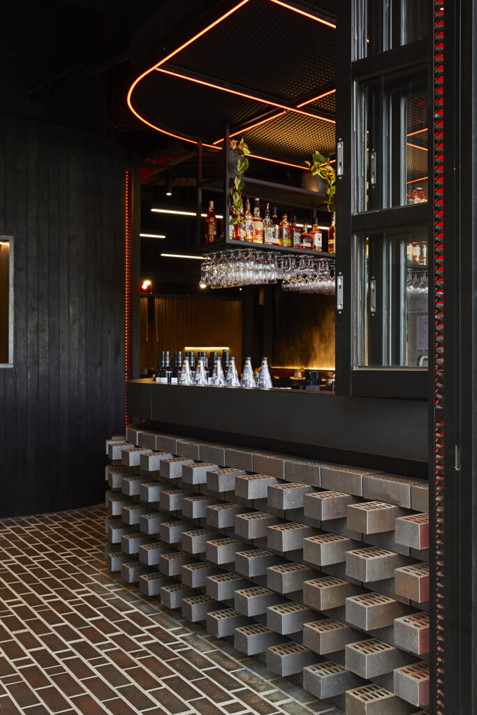
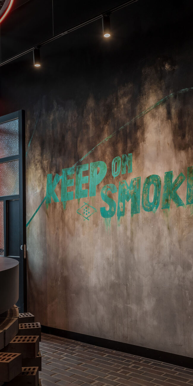
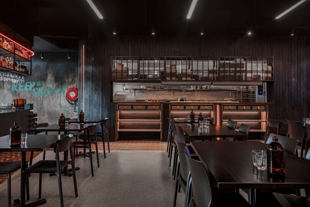
Their first store, a west side institution, had elements of grunge and punk in the fit out. Architects EAT used this as the foundation for the design process. After preliminary research, we turned to their menu items for inspiration. The food offered at the venue is prepared with wood fired cooking processes. To create a relationship between the menu and the physical store, the fit out used the cooking techniques to inspire the design. This resulted in custom wall textures that mimicked a smoke filled cavern, custom lighting that resembled hot plate grills and coloured lights that captured the effect of sizzling embers. Our favourite moment has to be the tongue-in-cheek fire hose reel arranged on the entry wall next to the brand’s slogan, ‘Keep on smokin’. This project was recently shortlisted for the 2022 Eat and Drink Design awards due to its successful creation of an authentic identity.

Photo Credit: Chris Murray
Looking to the menu and operations of your business can be a great place to start finding inspiration for a venue’s identity. While early collaboration between brand, fit out and menu is ideal, creating great spaces specific to your business is a matter of finding the common thread between service, fit out and brand. Architects EAT explored materials and textures that distilled the essence of wood fired cooking into a physical space for Up in Smoke’s second venue. For operators beginning their journey, finding the right design studio for you can help establish the identity of your store.
Written by Isabella White and Eid Goh
from Architects EAT https://eatas.com.au/


